Notifications
Clear all
Topic starter
Using the Time Series table, create a chart that shows the percent difference in Average Inventory on Hand for each Assortment by year and quarter.
How many quarters did the Electronics Assortment show a negative percent difference in the Average Inventory On Hand?
- A . 1
B. 2
C. 3
D. 4
Suggested Answer: C
Explanation:
If you chose 2, then you were very close but probably didn't plot the actual Percent Difference on your view. (One of the marks is just over the line).
✑ Firstly, Drop the Week ID onto the column shelf, and convert it to continuous since we need both Year and Quarter as mentioned in the question.
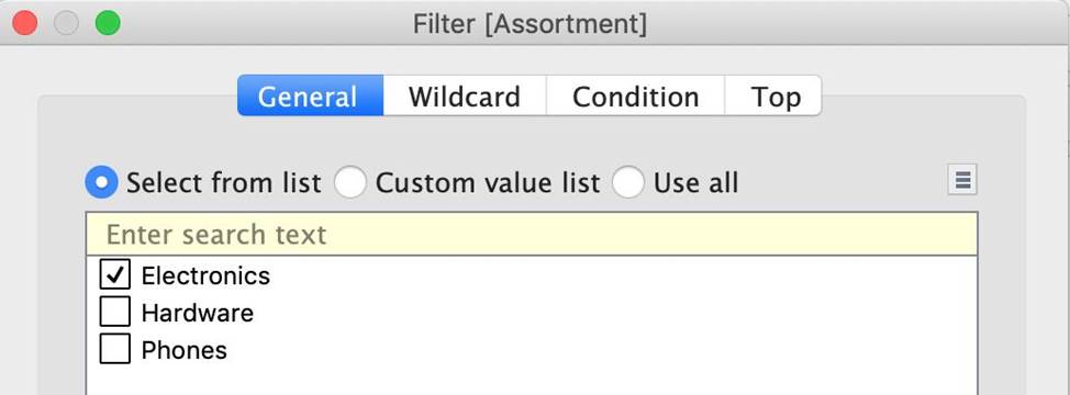
✑ 2) Next, Drop assortment to filters shelf so that we can focus on Electronics!
Explanation:
If you chose 2, then you were very close but probably didn't plot the actual Percent Difference on your view. (One of the marks is just over the line).
✑ Firstly, Drop the Week ID onto the column shelf, and convert it to continuous since we need both Year and Quarter as mentioned in the question.
✑ 2) Next, Drop assortment to filters shelf so that we can focus on Electronics!
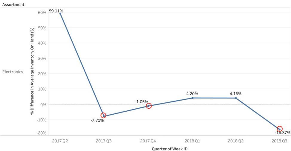
3) This should be your view now. Click on the Show Mark Labels icon as shown: The final view is as follows, with 3 points below 0 (i.e negative)
Posted : 18/11/2022 10:31 pm