Notifications
Clear all
Topic starter
27/10/2022 3:31 am
You need to create a visualization of running sales totals per quarter as shown in the following exhibit.
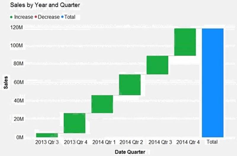
What should you create in Power BI Desktop?
- A . a waterfall chart
- B . a ribbon chart
- C . a bar chart
- D . a decomposition tree
Suggested Answer: A
Explanation:
Reference: https://docs.microsoft.com/en-us/power-bi/visuals/power-bi-visualization-types-for-reports-and-q-and-a
Explanation:
Reference: https://docs.microsoft.com/en-us/power-bi/visuals/power-bi-visualization-types-for-reports-and-q-and-a